Building a Kickass Portfolio
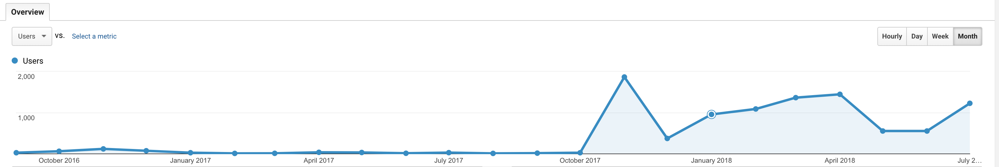
According to GitHub, I have had a portfolio site since September 1st, 2016. And, according to Google Analytics, I got less than 300 views on the two iterations of my portfolio from September of 2016 through October of 2017. In October 2017, I did a complete rewrite of my site, and the results were pretty dramatic. I got 1,861 views the first month, and I've averaged around a thousand hits on a month since then. Of course, correlation is not causation, but I do think the redesign definitely had a positive impact. It's not exactly Facebook, but for a portfolio site that doesn't provide the viewer with anything but information about me, I think these numbers are pretty okay!
In this post, I am going to go through an in-depth look at what has worked for me, what hasn't, my tips for building an awesome portfolio, and other people's portfolios that I love.
What Didn't Work
Before I get to my current portfolio that I really love, I want to talk about my first two sites.
My First Portfolio
The first one was a Jekyll site which used SASS and Pug. I deployed it here for nostalgia's sake -- check out the projects -- they're all from college, and most are in C++!
This setup was unnecessarily complex for the actual content of the website. I used Jekyll, MaterializeCSS, SASS, and Pug for such a simple page -- I think the Gulp setup was longer than the actual CSS needed! I was just transitioning on to writing frontend code at any capacity, so this was really a learning opportunity for me to use SASS and Gulp. I had no need for Jekyll either -- I only had a few projects listed and only one page.
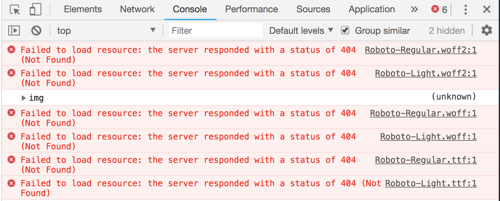
Also, there are a bunch of 404's showing up in the console for resources that were unfound. If I was a developer looking at the site, I would definitely be critical of that.
The screenshots for my projects are not great. They are all either of code or cropped in an un-optimal way.
The fonts are also too small, it is difficult to read the text. My social icons are not exactly the most prominent, which means that they probably didn't have too high of an engagement rate.
There were some things that I did well, though. I really like the highlighted words in the bio -- it draws the user to look at those keywords, even if they don't read the whole bio. I also appreciate that the site is responsive, so users could view the site on different sized screens. Currently, around 1/3 of my traffic comes from mobile sources, so its important to remember those users!
My Second Portfolio
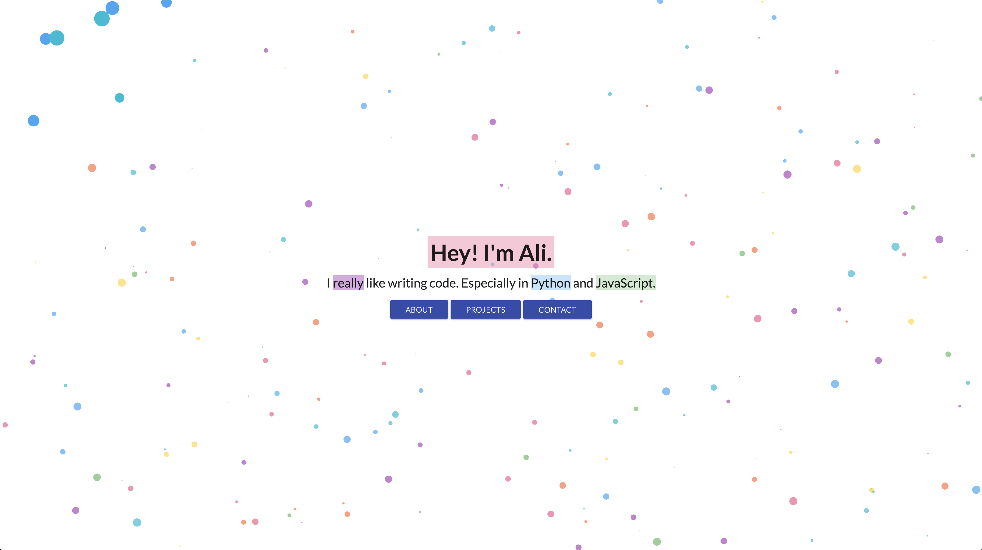
The second iteration was an HTML and CSS site with moving polka dots in the background. You can check it out here. I will admit, that I still have a soft spot for this portfolio.
I really like the moving bubbles, and how they change with user interaction. I also enjoy the minimalism of the site. I think the quick bio on the homepage is effective and expressed my interests well.
Again, the fonts are somewhat small, and having to go to a new HTML page to view any information about me is probably not the best. Also, having my talks and my code projects on the same page leads to unbalance.
Overall, though you can see a lot of the themes of this portfolio in my current one.
What Worked
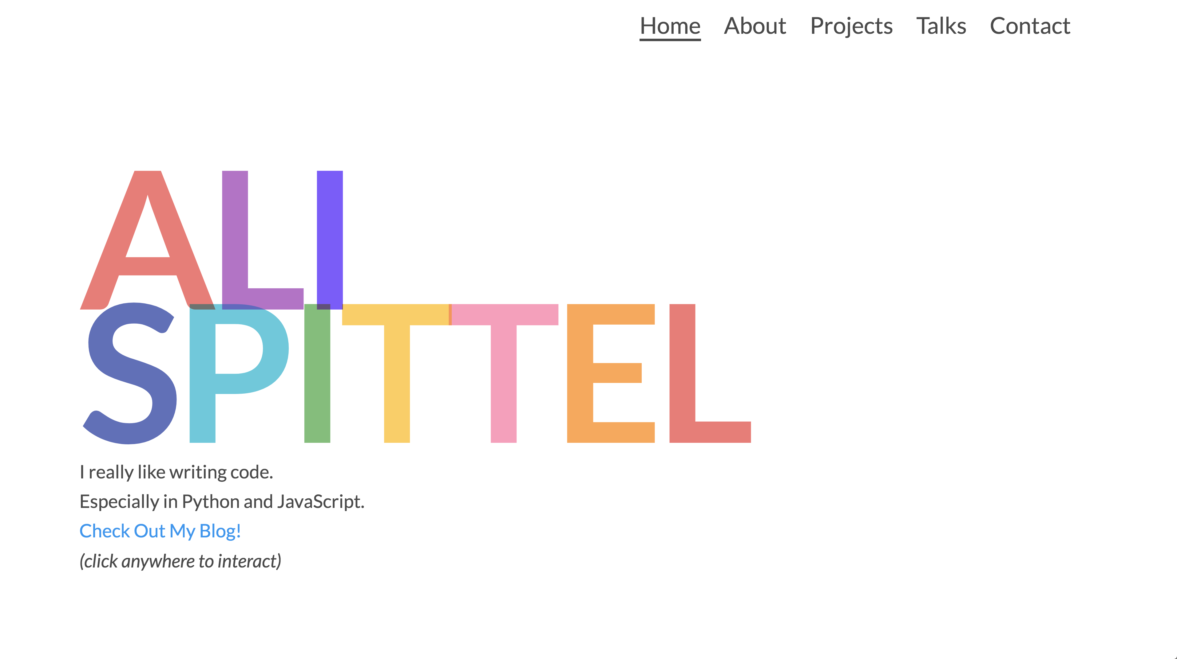
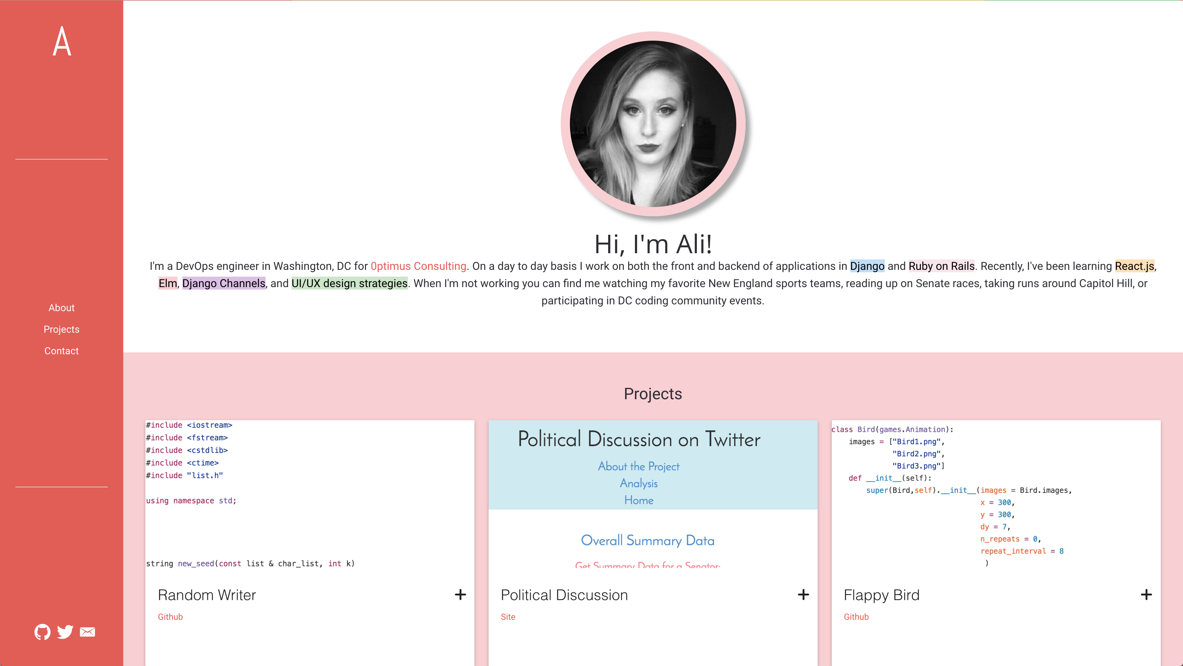
In October of last year, I started from scratch and built a portfolio that was a little bit out of the box. Your portfolio is one of the only sites that you will build that is a complete creative expression of yourself with no constraints. So, I went all in, interactivity, animations, you name it, it has it.
If you click anywhere on the homepage, a random shape appears. If you hover over the letters, they animate. If you hover over my picture on the bio page, it spins.
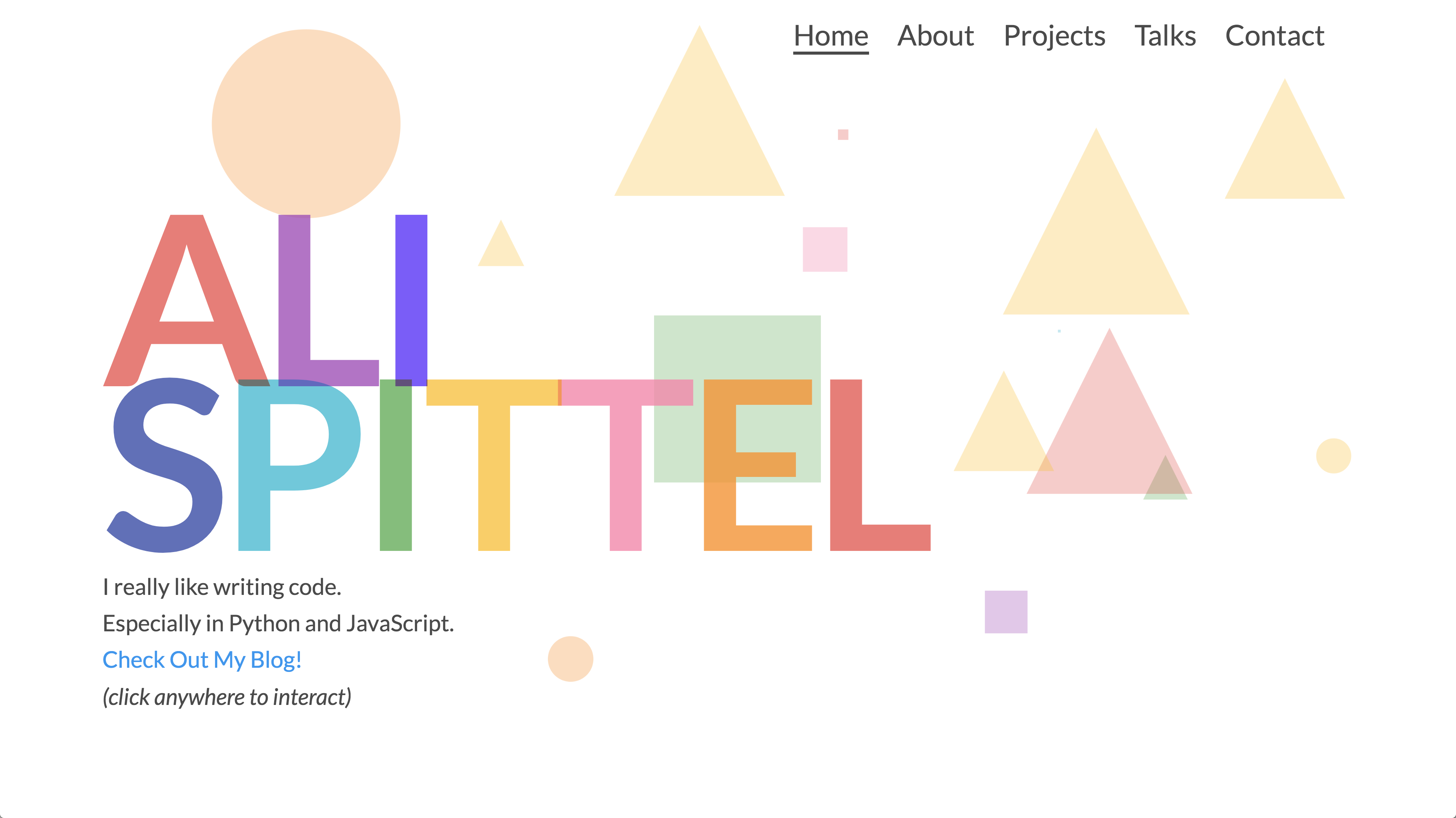
I used Vue for this portfolio, so it seamlessly transitions from page to page. I also increased the font sizes, so readers could gather information more quickly and easily. My contact page offers large buttons to follow me elsewhere on the internet.
The original version of this design was built in HTML, CSS, and a very few lines of JavaScript. As far as my technology needs go, this was totally fine. I wanted to move to Vue for my own maintainability needs -- the reconfigured setup makes adding new projects a lot easier. I also like the smooth routing that Vue Router offers, instead of navigating to an actual new page.
This design grabs people's attention, and they stay on the site in order to interact with it. Also, people reach out to me about my site a bunch, which, if I was looking for a job, would be awesome!
What I could still do better
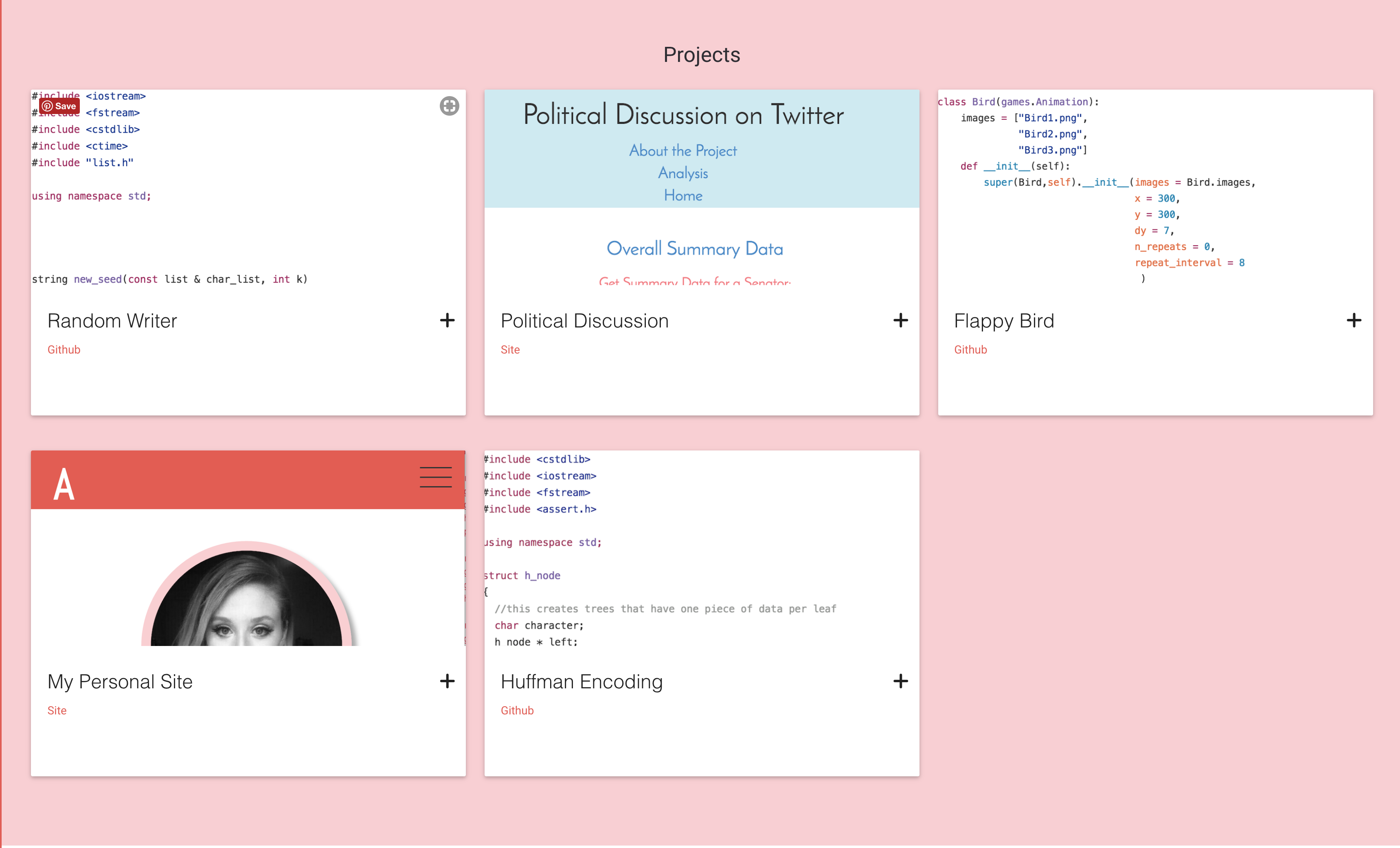
As far as effectiveness for converting people to my other social media, I could have links to my sites on each page rather than just the contact page. I also probably need to cull through my projects and choose a few to feature, rather than have 26 personal projects listed! I also don't have screenshots of my projects -- this is intentional, but I could probably get more traffic to them if I put pictures on them. I didn't like the different color palettes that adding in screenshots of my program would create. Also, I don't have many projects that I find super impressive in themselves. For the most part, they are pretty small, and I create them to learn something. I could further optimize my site, but for now, I really like where its at.
My tips for building a kickass portfolio
- Make a portfolio that is a true expression of yourself. Programming is in a lot of ways a creative field, so use your creativity!
- Make the site interactive, so people want to stay on your site, and they remember it.
- Buy a domain name -- I moved from aspittel.github.io to alispit.tel. I really like the play on my name, and you can get a lot of domains for pretty cheap. I use NameCheap, and it's totally worth the \$8.00 a year for the domain.
- Make sure you don't have console errors -- a lot of technical employers look for this, so make sure that your site is bug-free!
- Don't use a technology just for the sake of it. If you have a super minimalistic personal website, don't use a heavy-duty framework or library just for the sake of using it.
- Make sure your website works on mobile phones, and I would encourage making it work for users that use a split-screen setup.
- I would steer away from using a template found online -- to me, it's pretty apparent when these are used. I understand using them for people who aren't web developers, but if you are a web developer show off your skills!
- Use it to market yourself -- if you want to show off specific skills to employers, make sure those skills are featured on your site. I want people to visit my blog, so I have it featured on my home page. I also want to do more speaking, so I have a whole page dedicated to my talks. I no longer want to write C++ code professionally, so I took those projects off of my site.
- Make sure your links aren't broken. I have totally been guilty of this at certain points, but it doesn't look great, and then your viewers can't see that destination!
- Update your portfolio -- I'm guilty of not doing this that often too, but I try at least every few months to add new projects and talks to my site.
- Use a critical eye, and be intentional about the design. I use Sketch to draft my sites before moving to code.
- Think about page speed -- I run lighthouse testing on all of my sites to make sure they are performant.
A few of my favorite portfolios
- Timo Becker - You connect the dots and create different illustrations -- just play with it, it's awesome.
- Ben Halpern - this site is so memorable and fun.
- Julia Khusainova - This site is really minimalistic, but gets the point across.
- Nik Papic - another simple but pretty one.
- Robby Leonardi - a game resume!
- Dinesh Pandiyan - the color change is a really cool feature, and I like the minimalist design.