A Web Design Crash Course: From one non-designer to another
I will preface this by saying that I'm not professionally a designer. That being said, I like building pretty things and have had some success with that. A lot of developers seem overwhelmed by design, so I wanted to do a quick write-up with visual examples with quick tips on how to improve the visuals of your site. Rules are made to be broken, but if you want to make a great website as easily as possible, these are some good rules of thumb!
Color
I really enjoy playing with color on my websites, but there needs to be a balance and a coordinated color scheme for the site to look cohesive and professional. It's essential that these colors don't clash, that they have a reasonable level of contrast, and that they are consistent.
Consistency
Here's my color scheme for The Zen of Programming:

I use the same hex codes for green, pink, and grey for my backgrounds, headers, text, and buttons.
You can use CSS variables to make sure that your colors are the same throughout your code.
body {
  --pink: #cf92b7;
  --green: #59876b;
  --grey: #4a4a4a;
}

h1 {
  color: var(--pink);
}
If you are using SCSS or another CSS preprocessor, this is even easier!
As far as the number of colors involved in your theme, four is usually a good bet. Maybe make two of these colors neutrals (like black, white, or grey) and two bolder pops of color. Monochromatic color schemes that use shades of one color can definitely work as well!
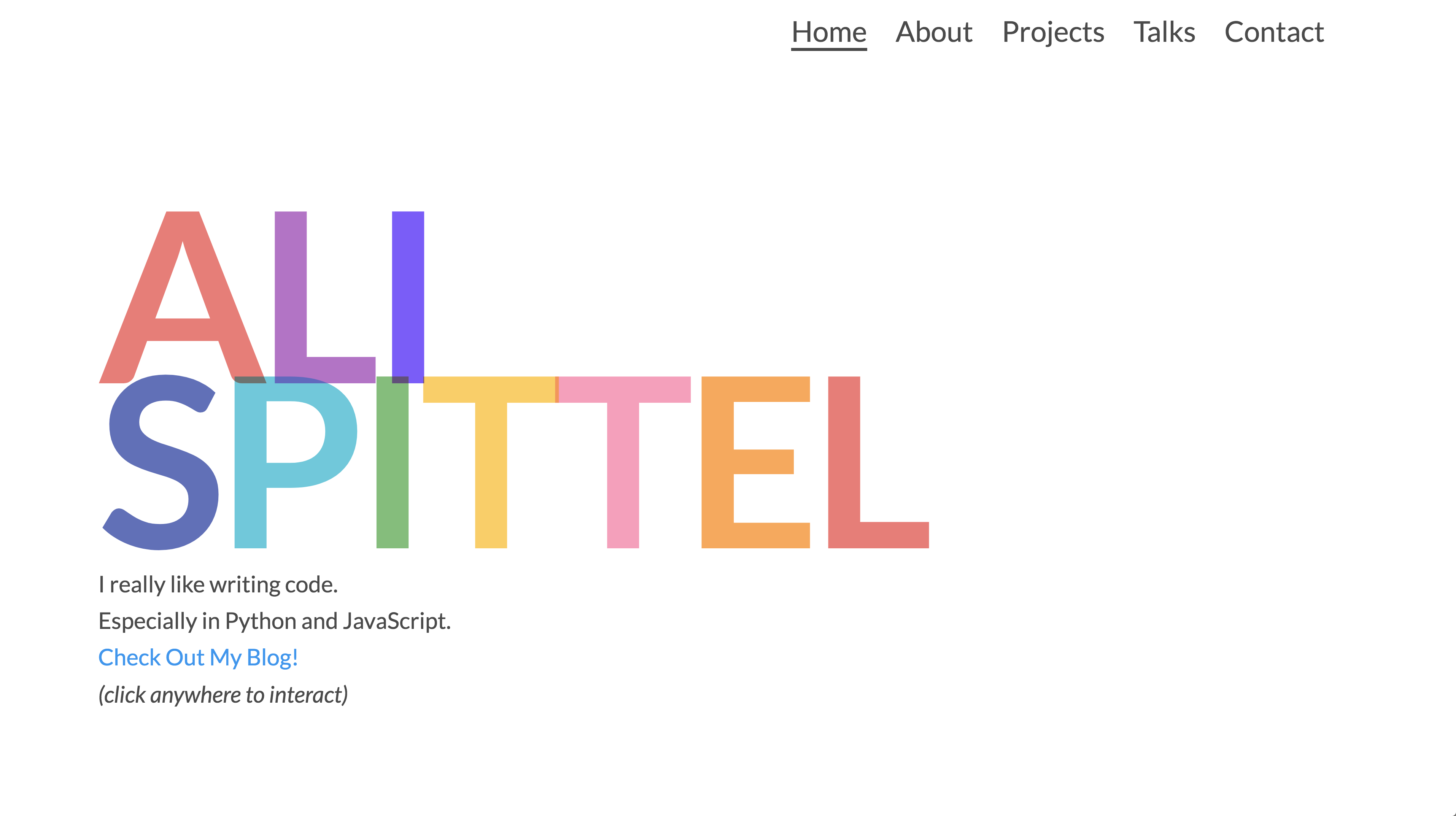
When I work with rainbow color schemes, I treat the rainbow as one color and then use two neutrals for everything else. For example, on alispit.tel I use a dark grey for some text, white for the background, and then the rainbow colors for letters and random shapes.
Clashing Colors
It's important to make sure your colors look good together and don't clash. Usually, the colors opposite to each other on the color wheel clash. Of course, you can make excellent websites that utilize clashing colors, but it is more difficult and may be better left to designers. Some examples would be red and green or orange and purple.
Also, keep the tones of the colors in mind -- if you are using a cool toned pink, a cool toned green may be good to pair with it instead of a warm-toned green. Warm-toned colors have redder undertones, and cool toned colors are bluer.
Contrast
Make sure there's a reasonable level of contrast between the colors on your website. If there isn't, it will be much more difficult to read your content. Here's an awesome site that will check your contrast for you. Lighthouse testing will also check this for you! In general, put light colors on top of dark ones, and dark colors on top of light ones!

Color Meaning
If you are working on a website for a brand, different colors have different implicit meanings to readers, and they can convey different moods so it can be helpful to keep those in mind.
Tips for choosing colors
There are a lot of awesome websites that make it easier to pick good color palettes that coordinate well.
I sometimes use the Coolors generator when I'm building a new site. I also follow this account on Instagram, and I will save color palettes that I like when I see them. Finally, If I just want to see a bunch of colors and choose between them, I use the color page on Materialize -- I like their colors!
Text
On most sites, the text will be the most critical part. You need it to be easy to read and for the most important content to be emphasized.
Here's an example of really hard to read text:
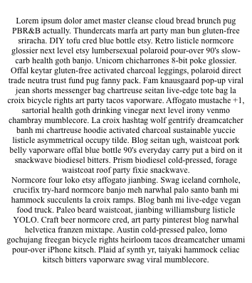
Let's work on making it more readable!
Spacing
Add spacing to your text content. There are a few types of spacing that can make your content more readable. The first is adding padding on the sides of your page.
On the sides of your content
On a lot of websites -- the text won't span the width of the page, it will be inside of a container that takes up only part of the page. This makes the content more comfortable to read since your eyes need to move less, and the page will look better. The W3C recommends fewer than 80 characters per line.
<style>
  .container {
    width: 80%;
    margin: 0 auto; /* centers the div on the page */
  }
</style>

<div class="container">
  <p>
    Lorem ipsum dolor amet master cleanse cloud bread brunch pug PBR&B actually.
    Thundercats marfa art party man bun gluten-free sriracha. DIY tofu cred blue
    bottle etsy. Retro listicle normcore glossier next level etsy lumbersexual
    polaroid pour-over 90's slow-carb health goth banjo. Unicorn chicharrones
    8-bit poke glossier.
  </p>
</div>
Line Height
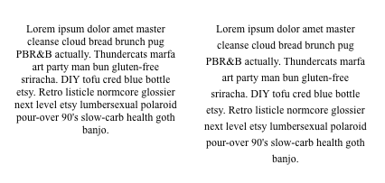
We can add line-height to add more space between lines of text. The most recent Android operating system added a more substantial line-height to notifications, which makes them easier to read at a glance.
Also, it is best for accessibility purposes to add more line-height -- the W3C recommendation is 1.5 to 2.0. Remember having to double space essays in high school? We're doing the same thing here, just online this time!
p {
  font-size: 18px;
  line-height: 2;
}
This will transform the text on the left to the text on the right in the image below.
Paragraph Padding
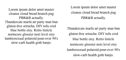
I would also make sure to add padding in between your paragraphs so that it is easy to differentiate between them.
p {
  padding-bottom: 27px;
}
Word Spacing
If you are using all-caps for a header, you may want to add more spacing in between words so that it is easier to differentiate between them.
Here is my blog's header with additional word spacing:

And here it is without:

h1 {
  word-spacing: 9px;
}
The first is a lot easier to read!
Alignment
It is easiest to read content if it is aligned to the left and un-justified for English and other top-left to right languages. Your content will be this way by default! Just make sure you don't have a text-align: center; on it! Feel free to center your headers or the container your text is in, but have long blocks of content left-aligned.
Readable fonts
Some fonts are easier to read than others. For content on the web, it is generally easier to read fonts that are sans-serif. Serifs are the little points that come off of the ends of letters in some fonts -- you can see a serif in the green circle in the diagram below!
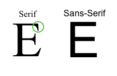
My rule of thumb is one decorative (think cursive or un-traditional) font or a serif font for headers and one sans-serif font for content per website.
Some of my favorite fonts:
Serif and Decorative
Sans-Serif
- Roboto
- Lato
- Montserrat
- Fira Sans
- Arial - this one comes on your computer
Color
Black text on a white background can cause eye strain because of too much contrast. I use dark greys for my content. Then, there is still a lot of contrast, but not as much as there would be with black text.
p {
  color: #4a4a4a;
}
The same is true with backgrounds -- a pure black is often not the best choice -- a dark navy or grey will make your content easier to read.
Sizing
There are differing opinions on how large your content should be and what unit of measurement you should use (em vs. px for example); however, the consensus leans towards 16-18 pixels and having that scale for people who zoom in or out on your site.
Headers of varying types should be larger than your content. Also, use different font weights to differentiate text.

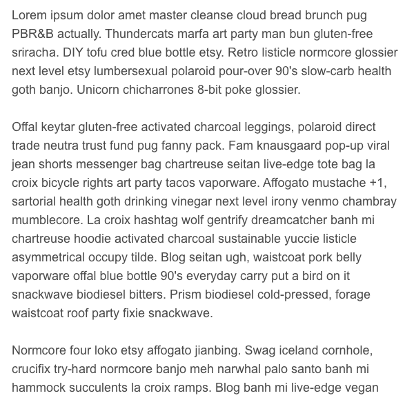
Once we change these things...
Our content becomes a lot easier to read!
Backgrounds
Making background images look good, especially with text on top of them, is really difficult. I would avoid background images unless they are critical to the site. I'm going to give a couple alternatives and solutions for making background images work if you still decide to use one!
On the below image, the text is challenging to read.

Split the Page
If you want to keep the image, you could split the page so that the picture displays on one half and the text on the other.

<style>
  .container {
    display: grid;
    grid-template-columns: 1fr 1fr;
  }
</style>

<div class="container">
  <div class="text">
    My Text
  </div>
  <img src="path/to/img" />
</div>
Use a less busy picture
If you want to keep the full page background image, if possible, use a simple picture without too much going on. In the one I'm using above, there are a lot of colors and large text that the user can still read. Using an image of a landscape or a pattern will be less distracting.
Add Text Shadow
You can also add a text shadow below your text to make it more readable.
.text {
  text-shadow: #4a4a4a 1px 1px 8px;
}
With the above changes in place and an increased font-size, the font on a background image becomes a lot easier to read!

Background Colors
I wouldn't use a super bright color for your background. Pretty much any color will be difficult to read on top of it, and it may strain people's eyes to read.
Calls to Action
When you build a website, there's usually something that you want the user to do. On e-commerce sites, you want the user to buy something. On a portfolio you probably want the viewer to contact you. On a blog, you want the user to subscribe. When you're designing a site, keep that action in mind. You may want to use a bright color, larger text, or feature that "call to action" on multiple places on your site. You also may want to make sure that it is visible everywhere on the site.
For example, my subscribe form for my blog is always in the sidebar, and it has color on it to grab the reader's attention. On my portfolio, I have links to my social media accounts on the home, about, and contact pages.
Emphasizing the important content will look different on every site, but it's important to keep the action you want the user to take in mind with each design choice you make.
More Reading
- Smashing Magazine - lots of design articles on here
- Designing with Sketch - an article I wrote on how to use the design software Sketch, which is what I use to design everything. A lot of the steps will apply to other design software as well.
- Hello Web Design - This is an awesome book that discusses web design geared towards beginners.
UI Frameworks
You may not want to start from scratch when you design a site, so using a UI Framework may be helpful. Some of these include Bootstrap, which I would make sure to customize since its heavily used; Materialize, which follows Google's Material design philosophy; and Grommet, my favorite aesthetically -- it also emphasizes accessibility.
Design Checklist
Since this is a pretty long post with a lot of tips, I wanted to distill the most important information into a checklist. It's written in GitHub markdown, so you can copy and paste it onto an issue or into a markdown file. Then you can either check the box or replace the space with an x for each action item.
## Color

- [ ] Uses consistent colors throughout
- [ ] Uses non-clashing colors
- [ ] The color choice makes sense for the business purpose of the site

## Text

- [ ] The text has padding on both sides.
- [ ] The line-height is 1.5-2.0
- [ ] There's padding between paragraphs
- [ ] If your headings are in all caps, there's increased word spacing
- [ ] Blocks of text are un-justified
- [ ] Blocks of text are left-aligned
- [ ] Sans-serif fonts are used for body text
- [ ] A maximum of two fonts are used - one decorative or serif and one sans-serif
- [ ] body text isn't pure black on white
- [ ] body text is 16-18px and is scalable

## Backgrounds

- [ ] Use a pattern or simple image
- [ ] A text shadow is used to make headings readable
- [ ] The background isn't too bright

## Calls to Action

- [ ] Important information is highlighted in order to attract user interaction