A Complete Beginner's Guide to CSS
CSS defines the way things look on your websites. HTML is your content, JavaScript adds interaction, but the appearance comes down to CSS. CSS is super powerful, and has a ton of awesome stuff built in. This post will take you from introductory syntax through creating layouts and making sites responsive!
Syntax
CSS is comprised of selectors and declarations. Selectors are how we tell CSS which elements to apply styles to. Declarations are the actual styles that will be applied for that element, i.e. they are everything within the braces. Within those declarations, we have properties and values. The properties are the type of style we are applying, the value is what we are actually applying.

The above CSS is saying, make the font color for all h1's blue. The h1 is the selector, the declaration is everything between the braces, the property is color, and the value is blue.
One final piece of CSS syntax is comments - these are ignored by the browser -- they are just there for humans to document their code. In CSS these look like the following:
/* this is a comment */Selectors
In CSS, we will use selectors to specify which HTML elements we want to style. Sometimes, this will be every element on the page. Other times, we will only want to select certain elements.
Sometimes, we will want to select each instance of an element on the page, for example, all h2's. We can select elements with their names!
h2 {
  color: blue;
  font-family: sans-serif;
}
Sometimes, we will instead want to select groups of elements -- say we only want certain paragraphs to be bolded, we can use classes to differentiate between those paragraphs.
<h2 class="center">Hello World</h2>
<h2 class="center">Hello World</h2>
<h2>Hello World</h2>
We differentiate element and class selectors by putting a . before the class name in CSS -- that way CSS knows we are looking for a class named center instead of an element!
.center {
  text-align: center;
}
Now, the first two h2 tags with the center class on them will be centered, and the third, without that class, will still look normal.
There are also some more complex selectors, such as:
h1, h2, h3 {
  /* The commas allow you to group selectors! In this case, all h1-h3's will be blue */
  color: blue;
}

h3:hover {
  /* pseudo-classes allow us to select elements in certain states. So, in this case, when an h3 is hovered, it will be pink! */
  color: pink;
}
Here's more about pseudo-classes, and here's an awesome game to practice with more complex selectors.
You may have used IDs for JavaScript code or other web development; however, I don't recommend using them for CSS, since they are only on one element and you want your code to be reusable!
Properties
Let's talk about the basic properties in CSS and how you can use them! We'll go into layout, which tends to be a little trickier, further down in this post, but for now, we'll go over color and text styling!
Color
There are a couple ways you can add color to a document using CSS, including text and backgrounds. Also, there are a couple of ways to represent colors in CSS.
The first is using named colors. There are 140 colors with names in CSS, these allow you to just put in a name and use them!
.red {
  background-color: tomato;
}
But — there are a lot more than 140 colors out there, so we also have a few more complex ways to represent more colors as well. These are based on the amount of red, green, and blue that comprise a color. Imagine you had three lights, one of each of these colors, and a background. If all three lights were off, then the background would be black. If all three were turned all the way up, the background would be white. And, if one of the lights was turned all the way up but not the others, the background would be that color. Then, the lights can be turned up in combination to create any color.
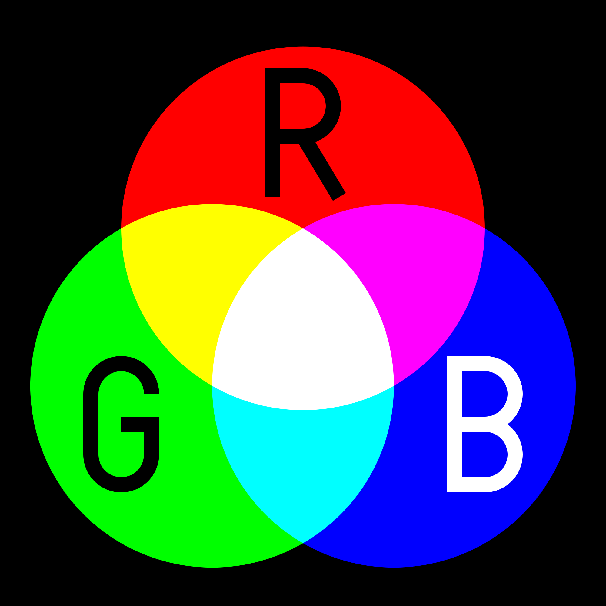
The RGB, RGBA, and hexadecimal colors are all derived from the above color combinations. Each color of the red, green, and blue "lights" can be given a value from 0 to 255, so that each value can be stored in one byte. In RGB and RGBA, you use base 10 numbers to represent the values, and in hex values, you use the hexadecimal system. RGBA values also have "alpha" values, which are the opacity of the color.

You can color text, backgrounds, borders and more with the above system!
Text
Another really important CSS feature is styling text. You can choose fonts, text spacing, and sizing.
There are some fonts that are built into most computers, which are referred to as web safe fonts. You can also add fancy fonts by including a font file. You can use sites like Google Fonts to find ones that you like for your sites.
body {
  /* if the user's computer has Arial, use that, if not Helvetica,
  then fall back to the operating system's default sans-serif font */
    font-family: Arial, Helvetica, sans-serif;
}
You can also change the size of text in a couple different ways — the first is pixels — which is usually the most beginner-friendly, then there's also ems and rems, which allow you to scale fonts differently. You can read more about those here.
The Box Model
CSS operates with the box model. First, you have your content. If you want to add spacing around that content within the background or border around it, you use padding. Then, you can add a border, which will normally be colored differently and patterned. Finally, outside of the background and border is the margin — this will be spacing between our element and other elements on the page.

One quick helpful margin snippet is margin: 0 auto;, which allows you to center most elements horizontally. The 0 value means that there is no margin on the top and bottom of the element. Auto adds equal margin to both sides of the element, centering it in its container.
Display
One of the more important CSS attributes is display. There are a few values you can use here. The first is none which hides the content. This can be helpful for hiding some content on different size screens or due to JavaScript events. inline removes linebreaks after elements, and it also means that adding height and width won't have an effect. blockmeans that the next element will be on the next line. inline-block is similar to inline, though you can apply height and width to the element. Fixed and sticky displays make elements stay in positions These are generally the most used and most traditional display properties, however, two more recent ones have really changed the layout game.
Layouts
Usually one of the trickier parts of CSS is creating layouts for your webpages. Getting things aligned properly used to be much more difficult than it is now, due to CSS Grid and Flexbox, two newer CSS display attributes . If you would like to learn them in more depth, CSS Tricks has great guides for both Grid and Flexbox. I'll go over a few tricks here too!
In order to center an element horizontally, you can normally use either text-align: center; or margin: 0 auto;. But — vertical centering used to be more difficult. Good news! Flexbox made it a lot easier. The following snippet placed on the parent of the element you're trying to center will center it both horizontally and vertically.
parent {
  display: flex;
  align-items: center;
  justify-content: center;
}
Bonus: here's a video version of this example!
You can create rows of elements with CSS grid really nicely.
.cards {
  display: grid;
  grid-template-columns: repeat(3, 1fr);
  grid-gap: 10px;
}
The above code generates three columns of equal size on the page. The grid gap adds spacing between each column.
Bonus: here's a video version of this example!
In addition, they make the "holy grail" three column plus header and footer layout a lot easier — check out this post for a couple ways on how to acheieve it with CSS Grid!
Defaults
Sometimes, there may be styling on your page that seems to be coming from nowhere. The browser actually has some styles pre-written for you. For example, there's an 8px margin on the body, a 2px border on table blocks, and headers have larger fonts. Sometimes you don't want these pre-loaded styles, so you can override them!
Cascade
One of the more notorious and occasionally controversial CSS features is the cascade. This mimics inheritance in object-oriented programming, and it defines how styles override one another. If developers use a CSS library, such as Bootstrap, this may be more difficult to navigate.
CSS selectors have various levels of specificity which define how styles are overridden when more styles are applied.
If, for example, we have the following CSS code:
body {
  font-family: sans-serif;
}
All of the text with in our body tags will be sans-serif — even if they are also within a h1 or p or any other tag. But, sometimes we'll want h1's to be serif instead, which we can add like so:
h1 {
  font-family: serif;
}
Now our h1's have a serif font, all other tags within the body are still sans-serif.
Also, different selectors have different levels of specificity. ID's are the most specific, though I generally don't use them for CSS since using them isn't very modular, then classes, then elements themselves, then their parent elements. So, if I add styling to a class, it will override styles added to the element. Using the cascade can be tricky, but it makes your CSS more reusable.
Media Queries
Sometimes you will want certain attributes to change depending on screen size. You can do this using media queries.
The following CSS selectors will only apply when the screen is smaller than 800px across. You can change to min-width for mobile first!
@media only screen and (max-width: 800px) {
  body {
     background-color: MediumOrchid;
  }
}
Animations
CSS allows users to create animations with keyframes. You can specify attributes at certain points in the animation, how long that animation will take, and the timing function performed.
In addition, you can add transforms that are applied when a pseudo-selector is added, such as an element is hovered over. These are super performant!
Read More
This post is barely scratching the surface of all the things you can do with CSS, it's super powerful and a very important part of the web. Here are some resources where you can dive a little deeper
- CSS Tricks
- MDN
- 5 CSS Tips You Didn't Know You Needed
- Having a Good Relationship with CSS
- CSS Specificity